Top 10 Color Scheme Interior Design Concepts
Elevate your space with these top 10 color scheme interior design concepts. From bold and dramatic to soft and serene, discover how to harness the power of color to create a stunning and harmonious home that reflects your unique style.
Color is one of the most powerful tools in interior design, capable of transforming a space from dull and drab to vibrant and inviting. The right color scheme can evoke emotions, set the tone for a room, and express your personality and taste. Whether you're drawn to bold hues or prefer a more muted palette, there's a color scheme out there to suit every style and preference. In this article, we'll explore the top 10 color scheme interior design concepts to inspire your next decorating project. From timeless classics to cutting-edge trends, get ready to infuse your home with color and create a space that truly feels like you!
1. Monochromatic Magic
A monochromatic color scheme revolves around variations of a single color, incorporating different shades, tints, and tones to create a harmonious and unified aesthetic. By sticking to one hue, such as various blues or grays, designers can achieve a sense of cohesion and simplicity that lends a space an air of calmness and sophistication. This approach allows for subtle nuances in color while maintaining overall visual consistency, making it particularly effective in creating serene and elegant environments. Whether used in interior design, fashion, or graphic design, a monochromatic palette offers versatility and timeless appeal, making it a popular choice for creating stylish and balanced compositions.
2. Dynamic Duo: Complementary Colors
Complementary colors, found opposite each other on the color wheel, create a striking visual impact when paired together. This dynamic combination, like red and green, blue and orange, or yellow and purple, enhances each hue's intensity, resulting in a vibrant and energetic aesthetic. By juxtaposing colors that naturally contrast, complementary schemes evoke a sense of harmony and balance while commanding attention. Whether in interior design, art, or fashion, utilizing complementary colors adds depth and excitement to compositions, making them visually compelling and memorable. The bold interplay of opposing hues infuses spaces with vitality and captures viewers' attention with its captivating contrast.
3. Triadic Triumph
A triadic color scheme employs three colors that are evenly spaced around the color wheel, such as red, yellow, and blue. This method of color selection achieves a harmonious balance while offering visual intrigue without overwhelming the senses. By incorporating hues from various segments of the color spectrum, a triadic scheme creates a dynamic and lively atmosphere. Each color plays a distinct role, contributing to the overall composition while maintaining a sense of cohesion and unity. Whether applied in interior design, graphic art, or fashion, triadic color schemes offer versatility and versatility, allowing for endless creative possibilities while ensuring a visually appealing result.

4. Analogous Allure
An analogous color scheme employs colors that sit adjacent to each other on the color wheel, such as blue, green, and teal. This strategic selection creates a harmonious and soothing aesthetic, evoking a sense of tranquility and cohesion within a space. By utilizing colors with similar undertones, an analogous scheme ensures easy coordination and seamless integration of various elements. The subtle transitions between hues result in a visually pleasing atmosphere that feels cohesive and balanced. Whether used in interior design, graphic composition, or art, an analogous color scheme offers versatility and versatility, providing a foundation for creating serene and inviting environments.
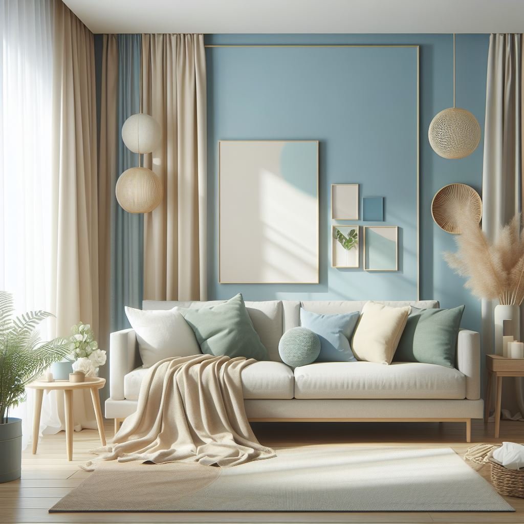
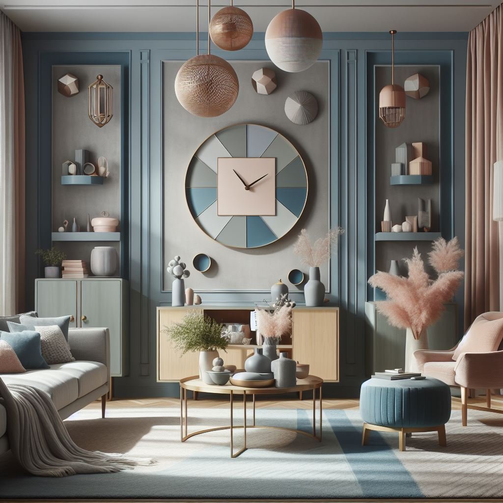
5. Serene Shades: Cool Colors
Cool colors like blue, green, and purple are renowned for their calming and soothing properties, making them ideal choices for spaces intended for relaxation and tranquility. By incorporating these hues into your design, you can cultivate a serene atmosphere that promotes a sense of calm and rejuvenation. Whether used in bedrooms, bathrooms, or meditation areas, cool colors have the power to create a peaceful ambiance that encourages unwinding and stress relief. Their soft and gentle tones evoke feelings of serenity and harmony, providing a soothing retreat from the hustle and bustle of everyday life.
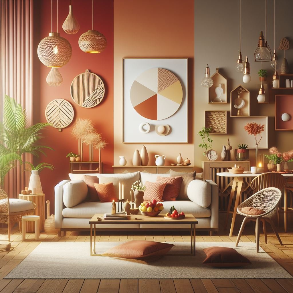
6. Warm Welcome: Warm Colors
Warm colors like red, orange, and yellow exude energy and vitality, making them excellent choices for areas intended for socialization and interaction. By incorporating these hues into your design, you can cultivate a cozy and inviting atmosphere that encourages conversation and connection among occupants. Whether applied to living rooms, kitchens, or dining areas, warm colors evoke a sense of warmth and hospitality, making guests feel comfortable and welcomed. Their vibrant and lively tones infuse spaces with energy and positivity, creating an inviting environment that fosters social engagement and lively interaction.
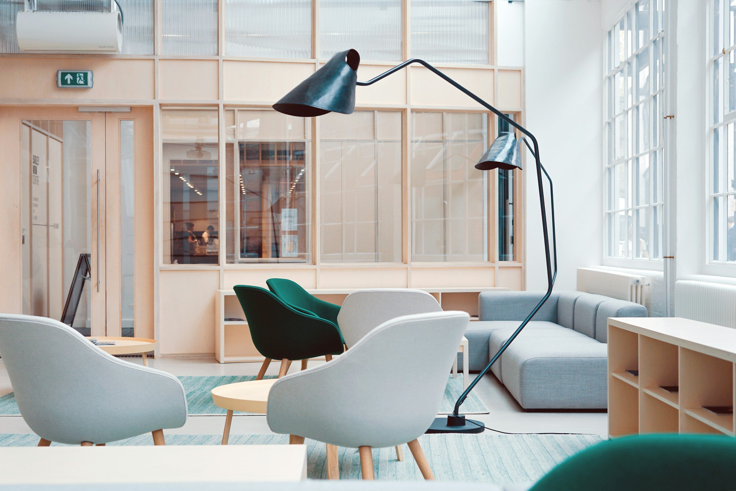
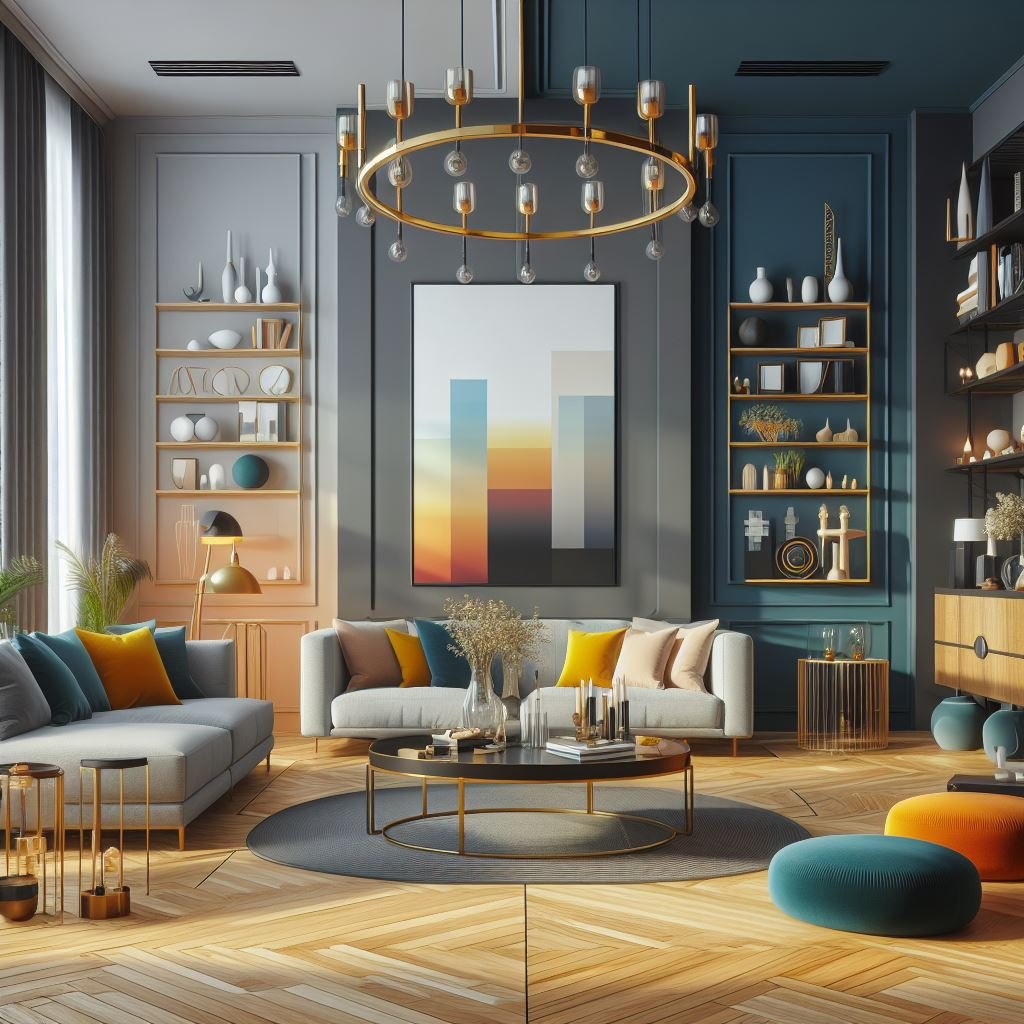
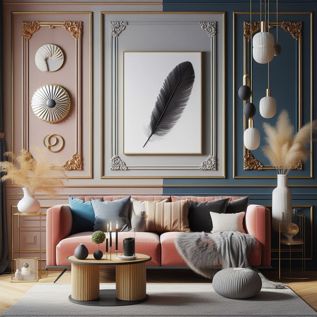
7. Bold and Beautiful: High-Contrast Schemes
High-contrast color schemes make a striking statement by pairing colors that are distinctly different from each other, such as stark black and white or rich navy and vibrant mustard yellow. This bold approach creates a dynamic visual impact that immediately draws the eye and adds intrigue to any space. By juxtaposing light and dark shades, high-contrast color schemes enhance depth and dimension, amplifying the overall aesthetic appeal of a room. Whether applied in modern minimalist designs or eclectic interiors, these dramatic combinations create a sense of drama and sophistication, making them perfect for making a bold design statement in any setting.
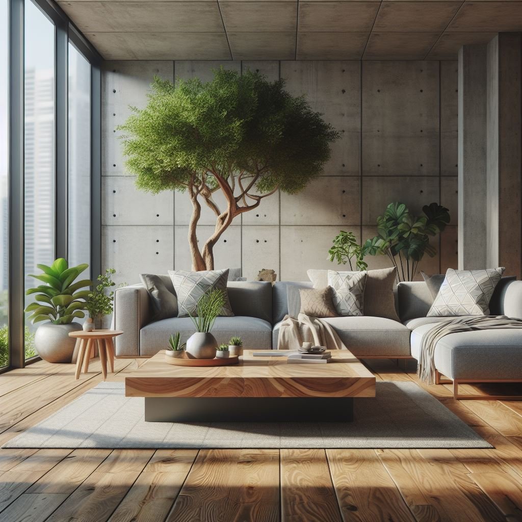
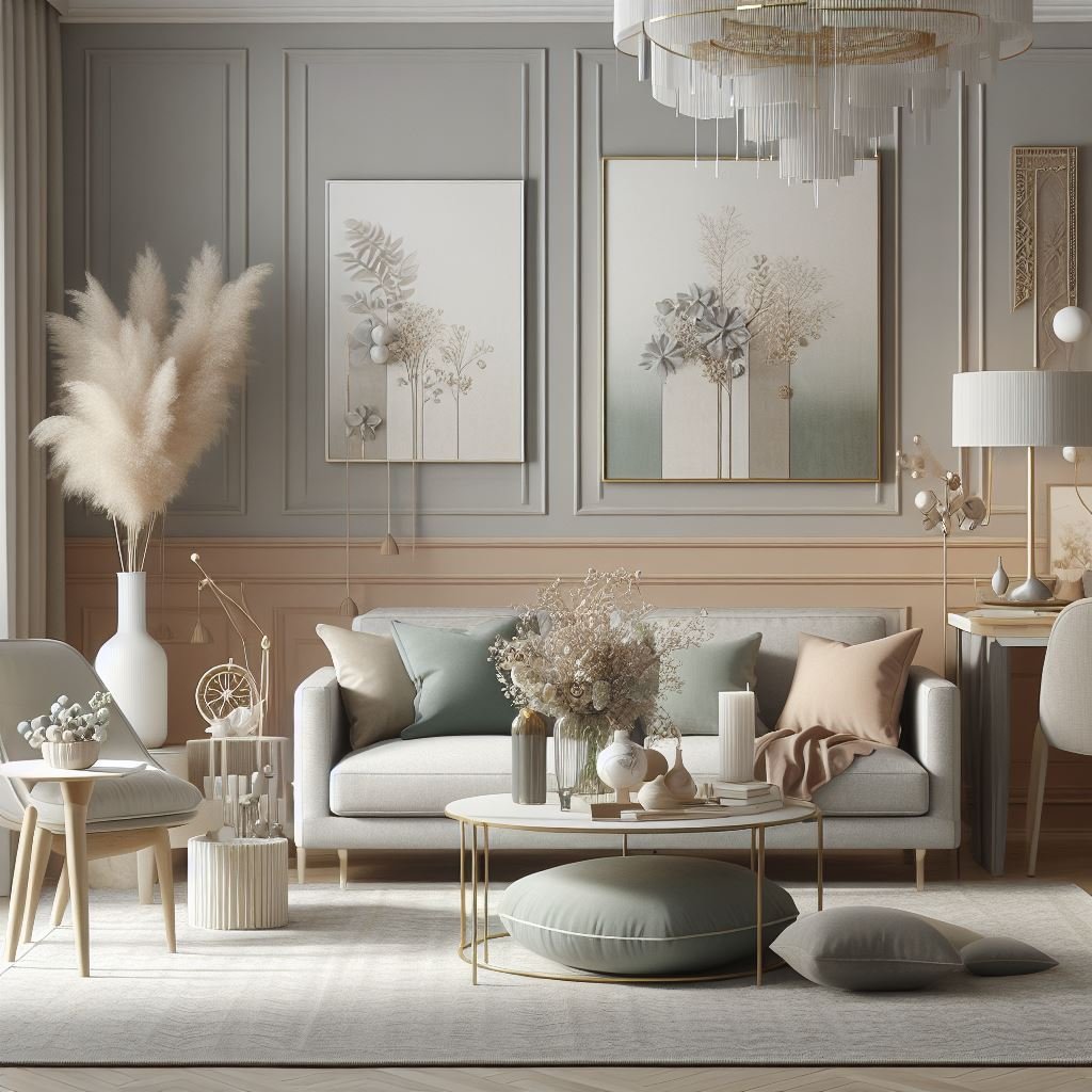
8. Soft and Subtle: Low-Contrast Schemes
Low-contrast color schemes embrace a subtle elegance by employing colors that share similar hues and intensities, such as a range of soft grays or warm beige tones. This approach creates a gentle and harmonious visual effect, imbuing spaces with a quiet sophistication and understated charm. Ideal for minimalist or Scandinavian-inspired interiors, low-contrast palettes promote a sense of serenity and balance, allowing furnishings and architectural details to shine without overwhelming the senses. By harmonizing color tones and minimizing visual distractions, these schemes create a cohesive and inviting atmosphere that exudes timeless elegance and effortless style.
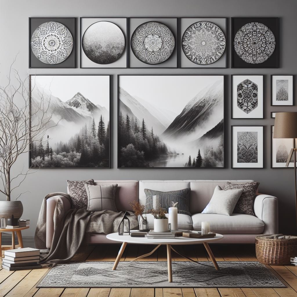
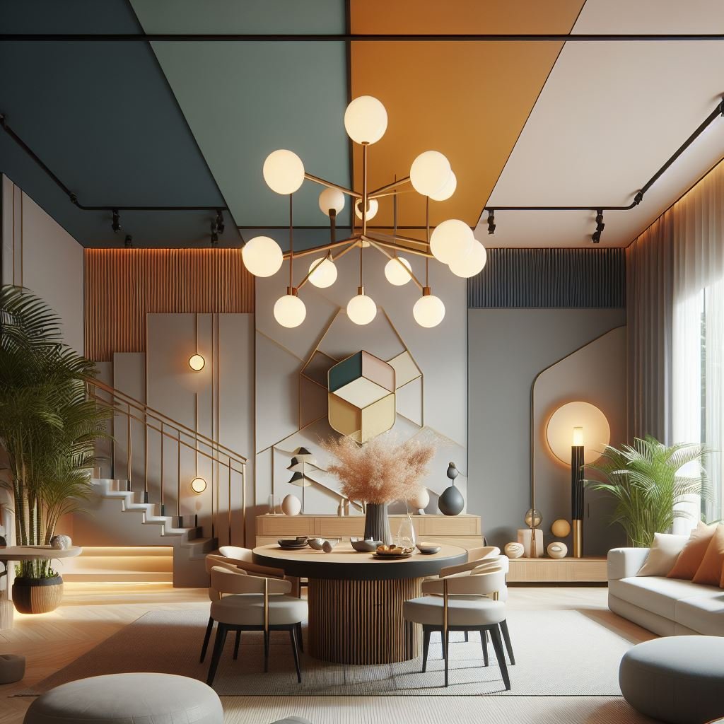
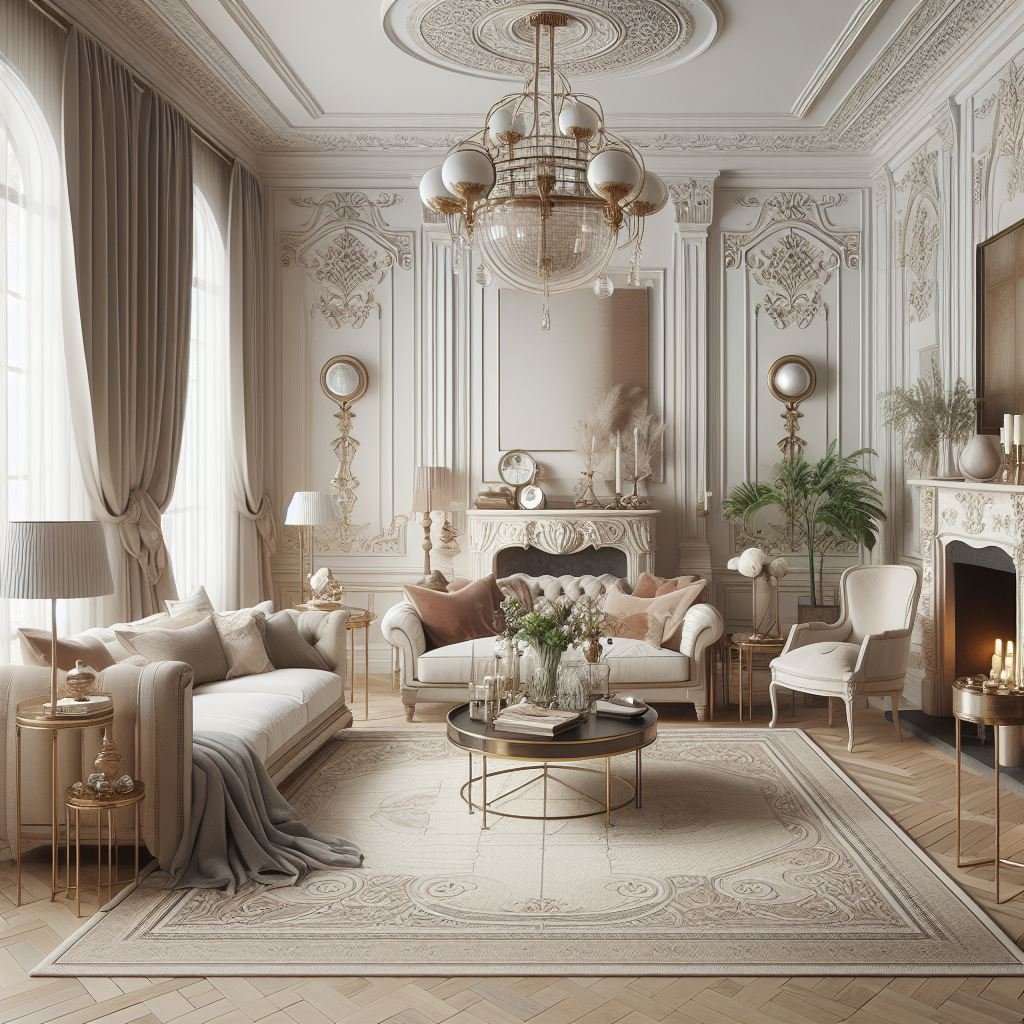
9. Timeless Elegance: Neutral Palettes
Neutral color palettes, featuring shades like white, beige, and gray, offer unparalleled versatility and enduring appeal. By integrating neutrals into your design scheme, you can achieve a sense of timeless sophistication that transcends fleeting trends, seamlessly blending contemporary flair with traditional elegance. These understated hues provide a versatile canvas for expressing your personal style while creating a harmonious and inviting atmosphere. Whether used as a backdrop for vibrant accents or as the focal point of a serene space, neutral tones lend a sense of balance and refinement to interiors, making them a perennial favorite among designers and homeowners alike.
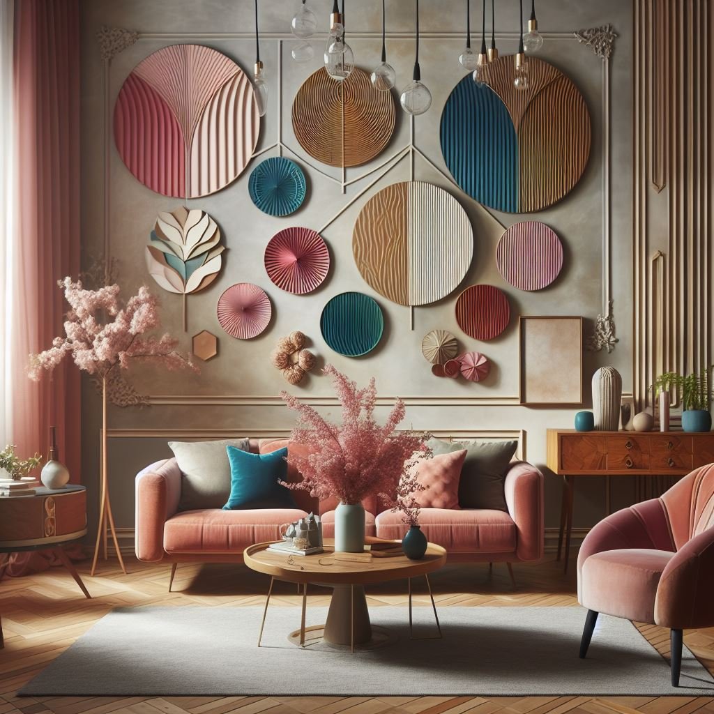
10. Statement Makers: Accent Colors
Accent colors serve as dynamic focal points within a design, offering a burst of vibrancy and personality to an otherwise neutral or subdued palette. These bold and eye-catching hues, strategically incorporated in accessories, furnishings, or architectural elements, infuse spaces with energy and visual intrigue. Whether it's a fiery red accent chair or a vibrant yellow rug, accent colors enliven interiors, evoke emotions, and reflect individual style preferences. By carefully selecting and artfully integrating accent colors, you can transform any space into a dynamic and engaging environment that captivates the senses and leaves a lasting impression.
Conclusion
Choosing the right color scheme is essential for creating a harmonious and inviting home that reflects your personality and style. Whether you prefer bold and vibrant hues or soft and subtle tones, there's a color scheme out there to suit every taste and preference. By understanding the principles of color theory and experimenting with different combinations, you can create a space that feels truly unique and reflects your individuality. So, let your imagination run wild and get ready to transform your space with the power of color!
FAQs (Frequently Asked Questions)
How do I choose the right color scheme for my home?
When choosing a color scheme, consider factors such as the size and layout of the room, the amount of natural light, and your personal preferences and style. Experiment with different color combinations and consider how they make you feel in the space.
What is the best way to incorporate accent colors into my design?
Accent colors should be used sparingly to add pops of color and visual interest to a space. Consider incorporating accent colors through accessories such as throw pillows, artwork, and decorative objects, or by painting an accent wall to create a focal point in the room.
Are there any color combinations I should avoid?
While there are no hard and fast rules when it comes to color, some combinations may clash or feel overwhelming. Avoid pairing colors that are too similar in intensity or hue, and be mindful of how different colors interact with each other in the space.
Can I use different color schemes in different rooms of my home?
Absolutely! In fact, using different color schemes in different rooms can help create visual interest and define each space's purpose. Just be sure to consider how the colors flow from one room to the next to create a cohesive and harmonious overall look.
How can I test paint colors before committing to a full paint job?
Many paint manufacturers offer small sample cans of paint that you can use to test colors on your walls before committing to a full paint job. Alternatively, you can purchase peel-and-stick paint samples or use online paint visualizer tools to see how different colors will look in your space.
Stay up to date with our latest ideas!